Everyone has heard the admonition to “keep it simple.” At Catena Creations, we have another admonition to go along with that: Just because you can, doesn’t mean you should.

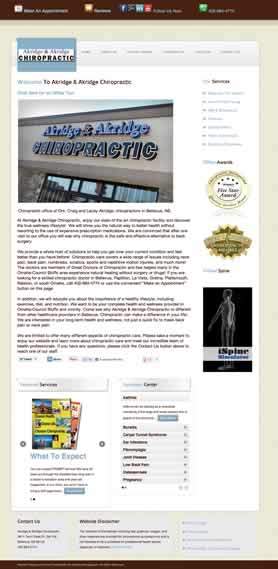
It was this problem that led my chiropractors, Drs. Craig and Lacey Akridge, to ask me to redesign and update their website for Akridge & Akridge Chiropractic.
Their previous site was hosted by a company that specializes in chiropractic websites. Although their site was attractive, it had many features that the doctors didn’t really need for their practice. And even with all these extras, there were some features that they couldn’t get added to the site — such as a photo show on the home page.
The design process started with the selection of a WordPress template from several I recommended that had the features the Akridges wanted in their new site. They selected the SmartBox theme by Oxygenna. This was very easy for me to customize to their specifications, and Oxygenna provided great customer support. It’s also a responsive theme, which means the page widths, text and images automatically resize to fit a desktop PC, laptop, tablet or smart phone.
The Akridges are very tech savvy, and pay very close attention to Google rankings and social media. Search engine optimization was very important to them. And they wanted to be able to import their patient reviews directly to their site, and make it easy for patients to leave other reviews.
When we re-created the site, we created a Patient Care Center where patients can find out what their first visit will be like, get answers to their questions, and watch videos for stretches and exercises that will help keep them pain-free.
At my suggestion, we also added a page about the Akridges’ community service. The office is very active in the Bellevue and Sarpy County communities, and I felt they should highlight this on their site. When you walk into their office, there’s a thermometer on the wall that shows how much money they’ve raised for their next contribution.

The new site was launched on July 15. Craig and Lacey already are hearing the positive feedback from new patients.
“We have had a few patients remark on how our website comes across very personal and not like a one-size-fits-all site,” said Lacey. “It’s like they kind of got to meet us before they came in.”
Another patient said “he liked how clean the site looked, and that it wasn’t all junked up with a bunch of confusing stuff. He said he actually made part of his decision to come in based on that, because he figured if our site was well maintained and personalized, our office would be as well!” Lacey added.
Future plans for the site are to update text, add more videos with stretches and exercises, and take photos that better fit the format of the headers and sliders.
I became a patient of Dr. Craig a little over a year ago. I had constant pain in my hip, and when I started feeling numbness in my legs, I knew I needed to do something different. I had been seeing another chiropractor, but he was treating just the symptoms and wasn’t trying to figure out what was causing the pain.
During my first visit, Dr. Craig did a complete exam and took x-rays. From this, he created a custom treatment plan for me. The pain in my hip was gone in two treatments!
As anyone knows, managing back pain is an ongoing process. I am so happy I found these great chiropractors in my neighborhood to help me manage this condition. I had a lot of fun working with them to rebuild their website, and look forward to working with them to add further enhancements.